Choosing Contrasting Yarns

Looking at hue rather than color value.

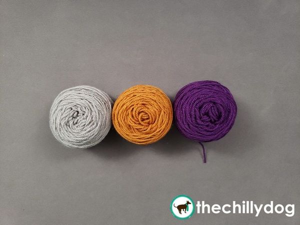
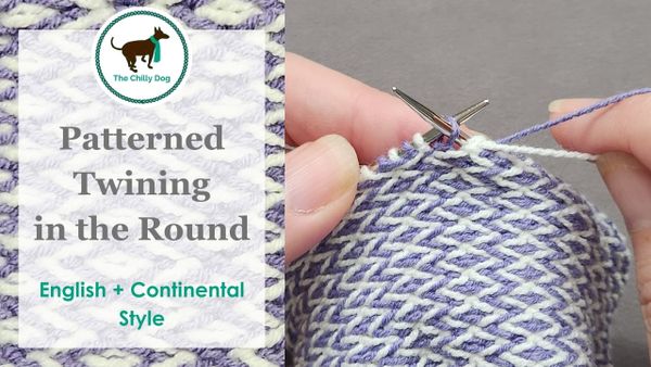
Often when you’re knitting a colorwork project like my Cubicle Socks Trio, the pattern will instruct you to use contrasting colors. I don’t know about you, but whenever I see the term “contrasting colors” a basic colorwheel pops into my head and I naturally think something like…purple and gold are on opposite sides of the color wheel, so clearly that’s contrasting.

That could be one approach to choosing your yarn colors, but today I’d like to share a simple camera trick you can do with the camera on your phone to help you choose contrasting yarns that will make your colorwork really pop because oftentimes it’s better to choose contrasting yarns by their value not their hue.

Lesson Notes

  • Introduction - 0:00
  • The Power of Grayscale - 1:05
  • Choosing Three Contrasting Colors 4:14
  • Final Notes - 5:19

Pattern: Cubicle Socks Trio
Additional Pattern: Knit Increase Sampler Squares
Yarn: Ewe Ewe Yarns Fluffy Fingering, Ewe Ewe Yarns Wooly Worsted


Yarn, Needle & Notion Support Provided by
Ewe Ewe Yarns
Ewe Ewe Yarns is home to happy knitting with merino yarn, bright colors and fun projects.
There's more to explore in the learning library!